As I've now done for the last fifteen years, I've recently completed another alteration of the logo for my long-running website, Caves of Narshe, to celebrate the site's 25th anniversary. This one, while not altering the form nearly as much as the prior change for the 20th, takes the basic format of the current logo and does something very different with it to stand out from the site's long history.
A Change of Direction
While the site has not visually changed significantly overall in the last ten years, the site logo had taken some significant turns. When the overall site design was last updated for the fifteenth anniversary, it went in a more straight-lined and rectangular set of patterns that looked a bit Mondrian-esque. The logo started off with a lot of dimension, with deep bevels and gradients all over. When the site reached its twentieth anniversary, the logo updated again with a much flatter look and a smoother-edged take on the core logo form. I was again looking to make a departure from that most recent look with the new site, and as such I went in a few very different directions.
 I started off by simply taking the 20th Anniversary logo, with its overlapping rainbow swirls creating a huge spectrum of color, and reforming the background to a five-pointed-star shape. The star was lovely and evoked the prior logo well, but in fact I found it to be too derivative of the last one and as much as I liked the way it changed the form, it was pretty quickly abandoned. I also attempted to revise the core logo into a shield shape, with the idea of forming some sort of classic football club crest around the logo. With this effort, I found that my initial attempt put me off of the entire concept - but with a different starting point, this is an idea whose time may come in another five years.
A third abandoned option came to me while flipping through the English translation of the Final Fantasy Ultimania for Final Fantasy VI, the first game covered by the website 25 years ago. The original concept artist for the series, Yoshitaka Amano, painted cherry blossoms into many of his illustrations, and the forms he used to represent them immediately made me connect the site's history covering Japanese Role Playing Games, and the original site logo's use of Katakana, to a traditional symbol of Japan in Amano's paintings. I sourced a watercolor illustration of cherry blossoms and used them to fill in the CoN logo, but the overall effect ended up looking to me like bad wallpaper, so it was a third concept that didn't carry forward much further.
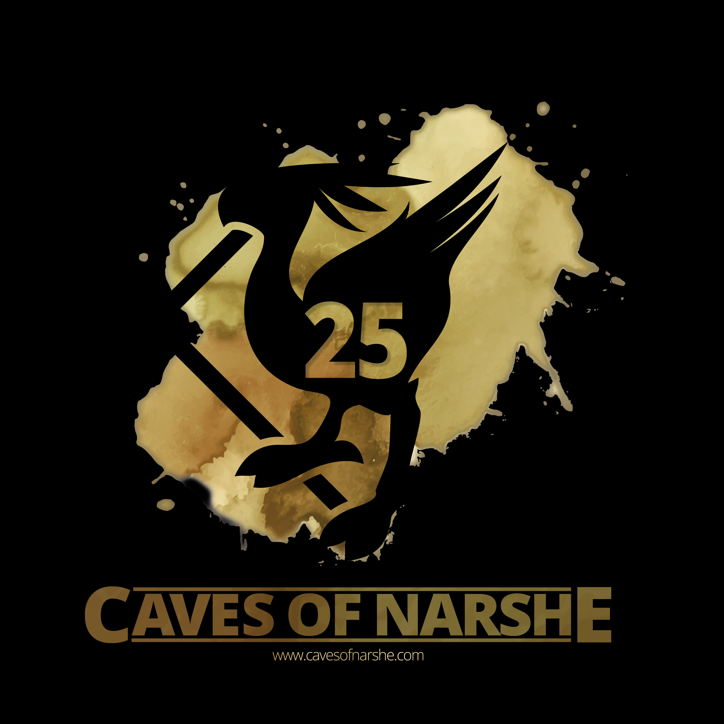
Finally, A Winner
The soft colors and shapes of watercolor made me think of something that combined a number of the previous ideas, though, in a way that resulted in the final logo; instead of watercolors used in an impressionistic way, I started working with watercolors in an abstract way, with a myriad of overlaid colors. This immediately appealed to me, as the naturally organic shape of the effect evoked the 20th Anniversary swirls in a completely different way that would stand out from all the clearly-defined edges of the main logo and the site itself.
I started by keeping the watercolor in a rainbow, as in the older logo, but quickly decided that it was too much color in a relatively small space and instead pivoted back to a golden set of hues similar to the logo of a decade ago. This time around, I kept the color palette closer together and made it more saturated to really emphasize the golden-ness of the anniversary (yeah, I know, gold is for the 50th but if this site lives that long I will probably shock myself to death). After getting the colors dialed in, I reorganized the individual elements of the logo itself to allow the watercolor "paint" to flow both above and below the main logo in order to create extra life and dimensionality, separating the new logo further from its flatter predecessor.
Once I was happy with the core golden logo, I decided to go a little further and come up with a watercolor palette for every subsection of the site, as all of the game coverage has a different base palette based on the game. I was worried that this work wouldn't look as "special" as its predecessor, and I felt much better once I realized that I was going to end up making not one, but over a dozen different variants of the logo, though not all ended up used on the site.
Not only did this logo really appeal to me personally, I think the relatively large number of variants I created makes it more approachable for a lot of people. There are even a couple variants not even in use that have their fans, as I found when I workshopped my progress along the way. For me, though, my personal favorite is used only in some desktop wallpaper and mobile lockscreen images I created for fans of the site to use. Freed from their primary use as the site logo and branding, I was able to take the logo and form it into featureless negative space in and around the golden "paint" to create a completely different feel, where the viewer themselves gets to create the logo from what's not shown. I think that style shows the truest "art" of any logo I've created for CoN in the last 25 years!
- Log in to post comments